The Terra Nova Hotel case
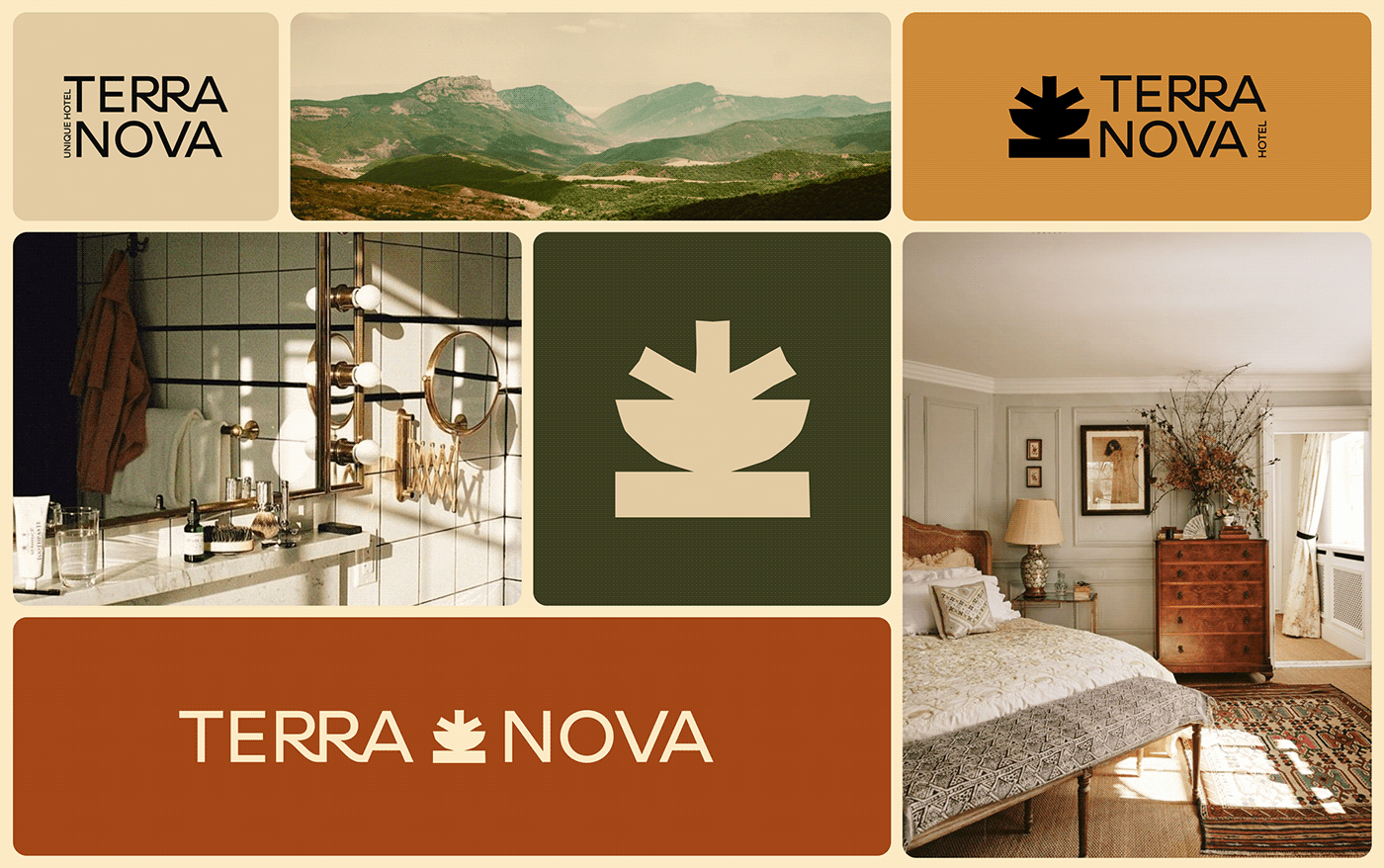
Terra Nova is more than a hotel—it’s an experience of refined hospitality, seamlessly blending contemporary comfort with the soul of exploration. In close collaboration with the hotel’s visionaries, we crafted a brand identity rooted in three essential pillars: authenticity (capturing the spirit of travel and discovery), serenity (creating a sense of retreat and balance), and timelessness (ensuring an aesthetic that feels both modern and enduring).
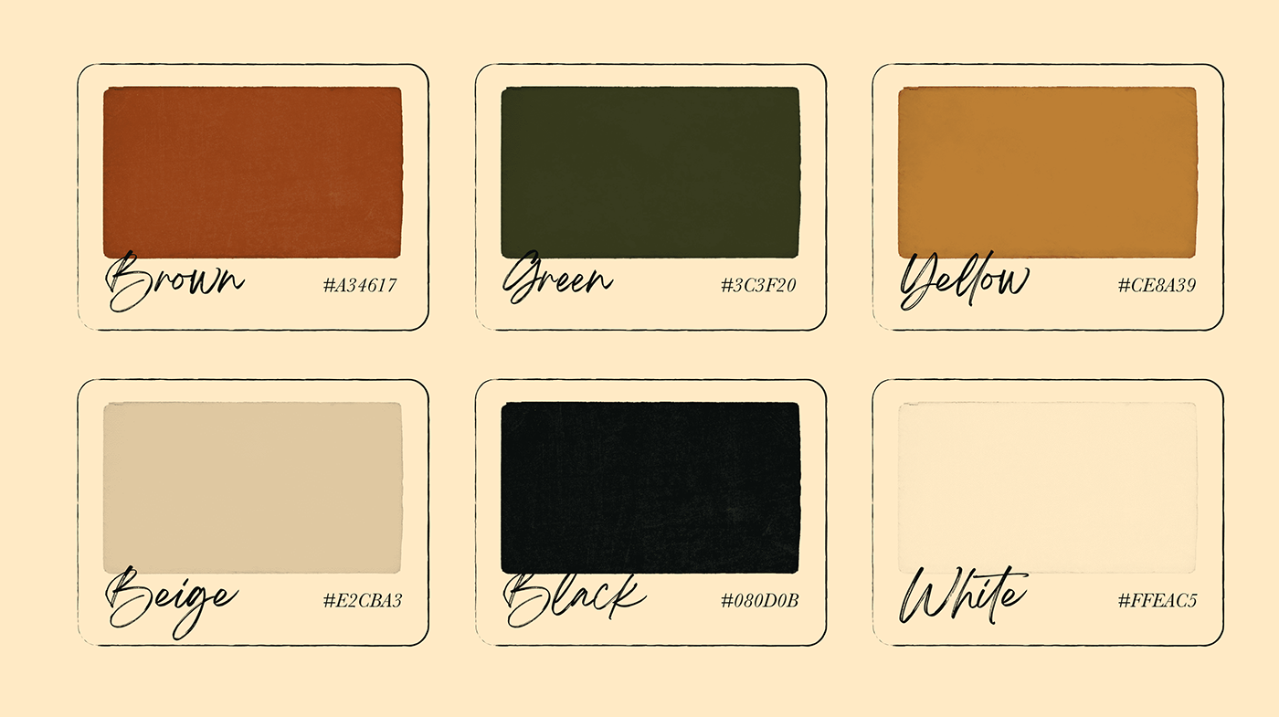
The logotype reflects this philosophy—elegant yet approachable, evoking the effortless sophistication of a well-traveled path. The typography is clean and inviting, balancing modern minimalism with a touch of classic refinement. A carefully curated color palette, inspired by natural landscapes and warm, organic textures, reinforces the sense of place and tranquility.
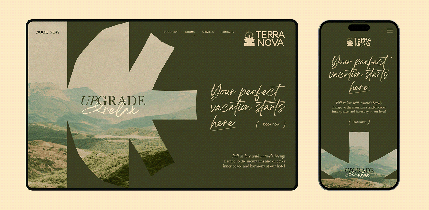
From print to digital, every design choice enhances the guest journey. The website is immersive and intuitive, prioritizing clarity and visual storytelling. Every element, from signage to stationery, is infused with the essence of Terra Nova—where hospitality meets discovery, and every stay feels like a new horizon.