The Court case
The Court is a refined tennis club brand that harmonizes tradition with modernity, embodying the precision, elegance, and competitive spirit of the sport. We developed a thoughtful strategy in collaboration with the club’s founders to define the essential pillars of its identity: prestige (reflecting the heritage and excellence of the game), dynamism (capturing the energy and movement intrinsic to tennis), and sophistication (expressing an elevated experience both on and off the court).
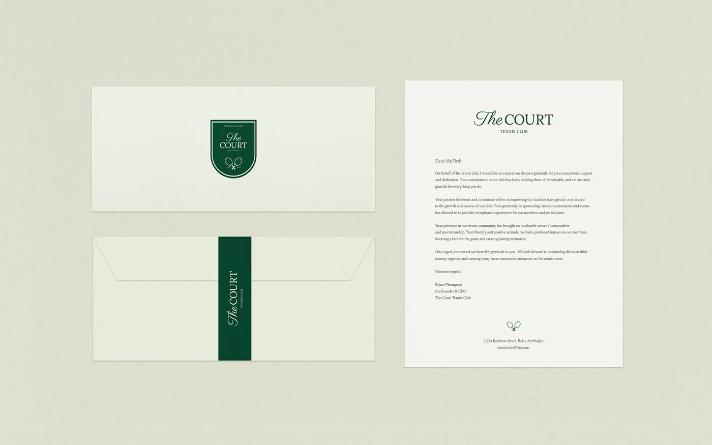
These principles shaped the visual identity. The logotype is assertive yet refined, evoking the crisp lines of a perfectly marked court. The typography blends classic influences with contemporary simplicity, ensuring a timeless feel. Color plays a crucial role—drawing inspiration from the deep greens, clay tones, and crisp whites of historic tennis venues, the palette reinforces both heritage and performance.
The same ethos extends to the brand’s digital presence and collateral, where clarity and impact reign. Every element is designed to feel effortless yet intentional, just like the perfect rally—where precision meets grace, and legacy meets the future.